[wip] Cómo hacer tu propia familia tipográfica con Fontra
Este último año he estado, entre ratos libres, trabajando en una tipografía llamada Zephyr Sans. Intenta ser una vuelta de tuerca al estilo de los iconos Breeze de KDE y la antigua familia tipográfica Oxygen Sans.

He tenido que investigar un buen rato para llegar a este punto, y pese a eso no diría precisamente que soy un erudito en este campo. Pero si te ahorro un poco de trecho para tu propio proyecto, pues eso que te llevas.
Como has podido adivinar, usaremos Fontra, un editor de software libre que funciona en las plataformas de siempre.
Creamos la fuente
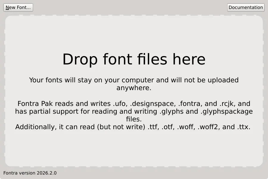
Para empezar, instalamos FontraPak desde https://fontra.xyz, que ejecuta tanto servidor como cliente de forma local en tu ordenador.
Esta división en dos partes permite la colaboración en tiempo real al estilo Figma, pero no es muy relevante por ahora.
Una vez abierto, aparecerá la ventana siguiente:
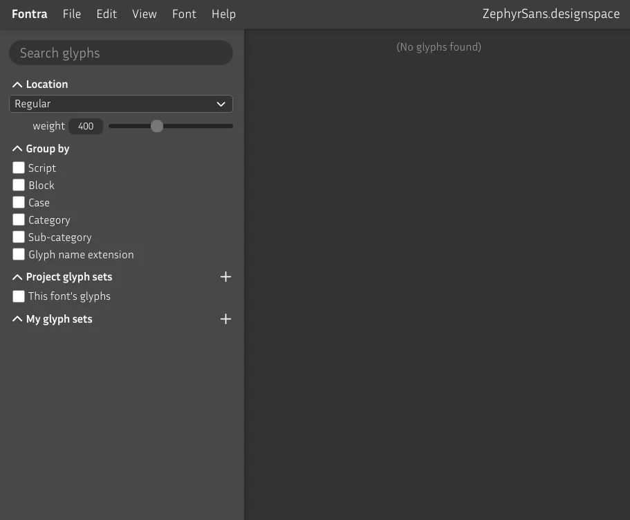
Haz click en New Font en la esquina superior derecha. Verás varios formatos (Designspace, Fontra, RoboCJK y UFO). Elige Designspace.
UFO es el formato estándar genérico para una fuente individual (guardado en carpetas como MyFont_Light.ufo, MyFont_Regular.ufo etc).
Un Designspace es una carpeta con varios UFOs (y un XML con .designspace) que agrupa las fuentes en una familia tipográfica. Al elegir Designspace evitas pillarte los dedos en el futuro si te planteas el llevarlo más allá, pero sin quitarle la posibilidad a potenciales colaboradores de usar sus programas favoritos como Glyphs, RoboFont, Fontlab etc. que suelen tener cosas más avanzadas como plugins, peines de curvatura (como el del CAD) y soporte para idiomas sin alfabeto latino.
Se abrirá una pestaña en tu navegador web como esta:
Añadimos el juego de caracteres
Los juegos de caracteres son la forma en la que especificamos los caracteres que planeamos tener en nuestra fuente. Puedes elegir una existente de colecciones como el de Google Fonts.
¿Ves la barra lateral a la izquierda? Haz click en el botón a la derecha de donde pone Project glyph sets. En el modal selecciona la colección Google Fonts y marca GF Latin Kernel para empezar, luego dale a guardar.
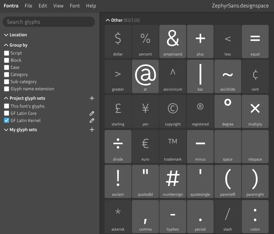
Ahora verás la cobertura del juego de caracteres de tu fuente, con tarjetas gris claro con vista previa para cada glifo soportado.
Métricas de línea
Antes de empezar a dibujar glifos, necesitamos pensar en la anatomía de la fuente que queremos crear.

Un proyecto Designspace nuevo en Fontra tiene 1000 unidades por em, aunque puede que a veces te encuentres otros proyectos con 1024 o 2048.
Aunque el formato sea vectorial, los nodos se redondean a la unidad más próxima, como si de píxeles se tratara, basado en esta resolución.
Ahora bien, de estas 1000 unidades verticales tenemos que elegir cuánto vamos a destinar a qué secciones. Coge un folio y boceta un poco. Dibuja los suficientes glifos como para sacar las proporciones para los ascendentes, la altura de x y los descendientes. Tras esto, asóciale tamaños de forma retroactiva literalmente midiéndolo en el papel y redondeándolo.
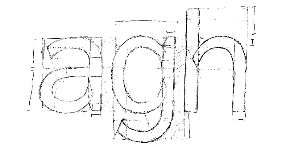
Se nota que lo dibujé antes de aprender esto en condiciones.
En este caso elegí hacer la a de dos pisos, y basar las medidas de donde el bowl y el hook conectan. En concreto:
- Desde el baseline a la parte de arriba del bowl: 2
- Desde el bowl a la parte de arriba del hook: √2
- Ancho: 2 × √2
¿Por qué estos en concreto? Porque me apetecía.
La altura de las mayúsculas se derivan de la altura x. En las fuentes de cuerpo (las que se usan para long-form text at small sizes [todo] maybe say "the ones used in long-form prose" instead) el caps-height to x-height ratio debería rondar entre el 65% al 75%.
[todo] I picked as close to 75% as possible – around where Inter and Helvetica sit – as my intention for this font is to be used on user interfaces. 550/740 is ≈ 75%, 775-550 = 225 (which matches the descender).
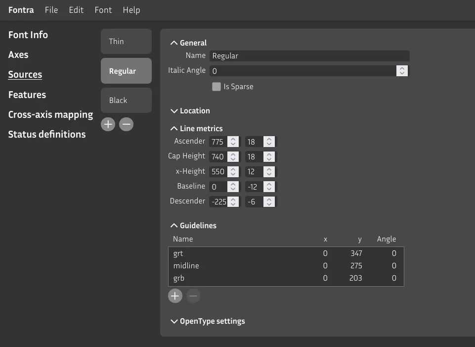
Los valores del lado izquierdo deben sumar a las unidades por em de tu proyecto (por defecto es 1000). 775 + 225 = 1000.
Contrarrestando los efectos ópticos
Los valores de la derecha actúan para las líneas de rebasamiento. Como norma general, estos aumentan de tamaño a medida que el texto es más pequeño.
Lee esta página para aprender más sobre esto.
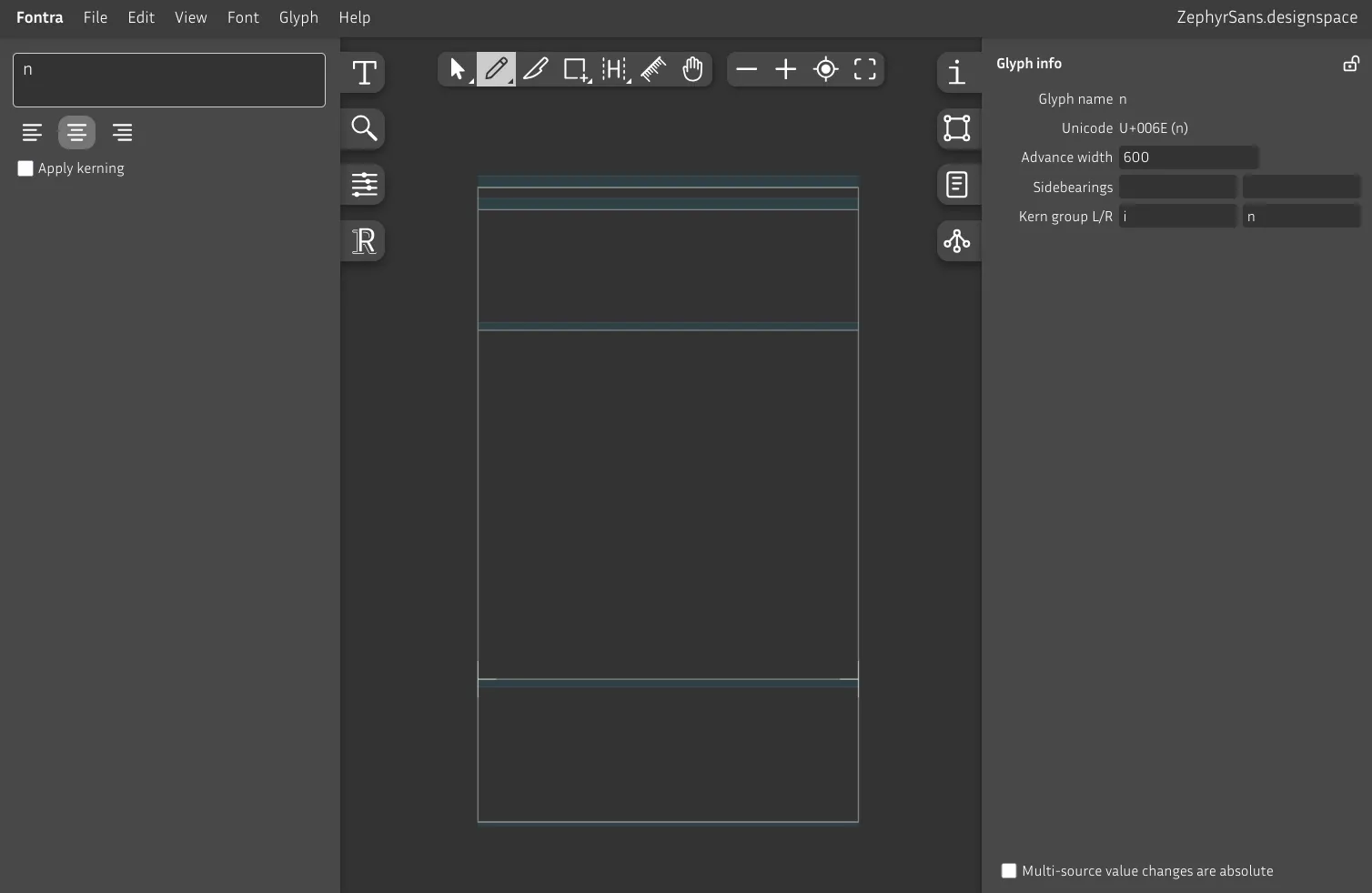
Dibujando nuestro primer glifo en Fontra
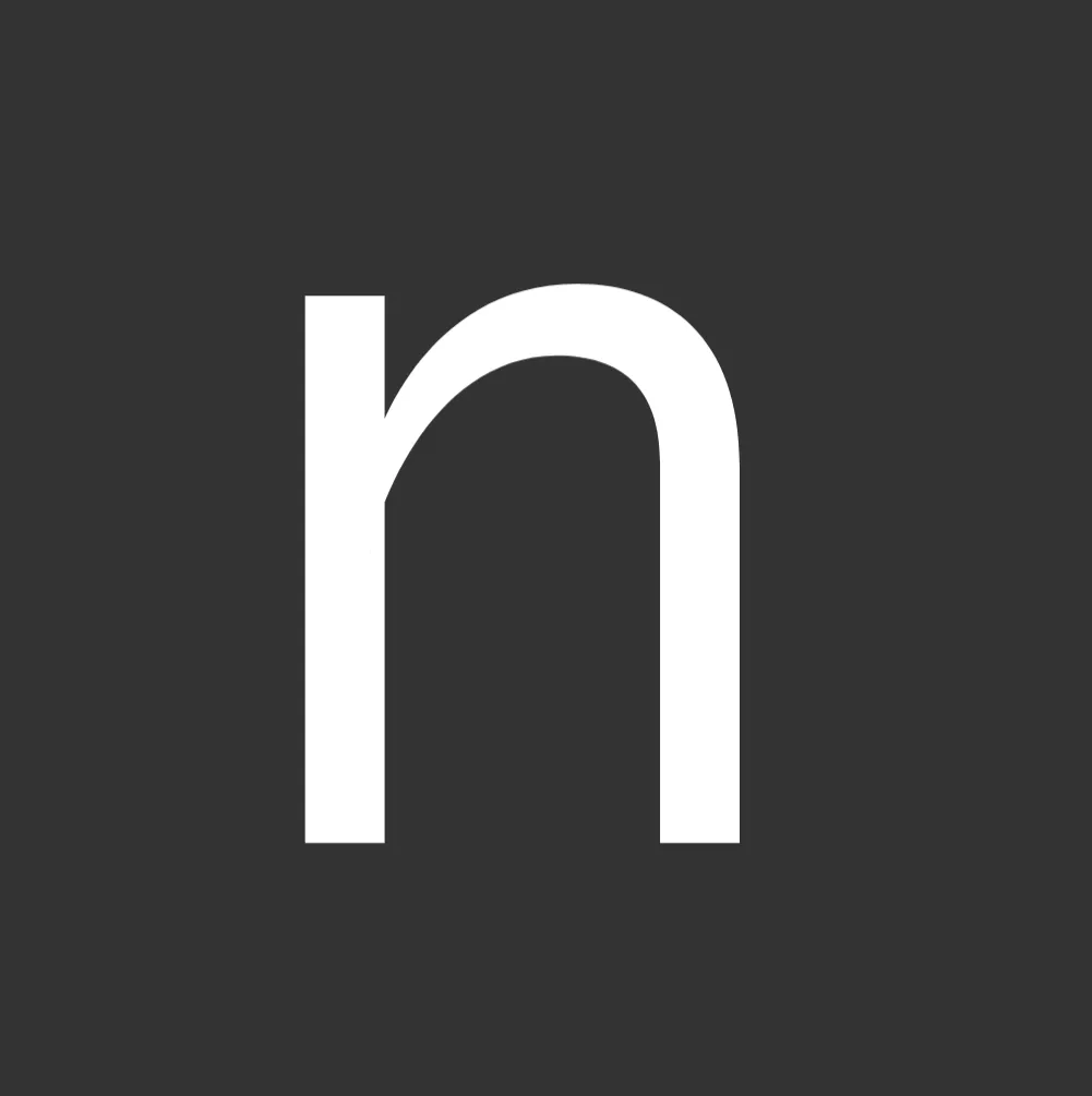
We can now start drawing our first glyphs, n and o. These will act as the base for the others.
Go back to the glyph grid and double click the n card. A new editor tab will open. The UI is pretty self-explanatory so just play around with it and we'll start drawing once you come back.
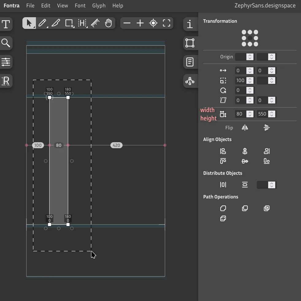
Select the rectangle tool, and add a rectangle from x-height to baseline to make a vertical stroke. Unlike on editors like Figma, the selection tool (Pointer) doesn't select the entire shape by just clicking on the fill. For that, double click on the shape's path.
On the right sidebar, select the Selection Transformation tab, then select a shape to see its width and height.
There's also an option to see the coordinates on each selected node. It's on View Glyph editor appearance Coordinates.
There's also a Ruler tool that sticks and rotates along the closest edge where you click, which is pretty handy.
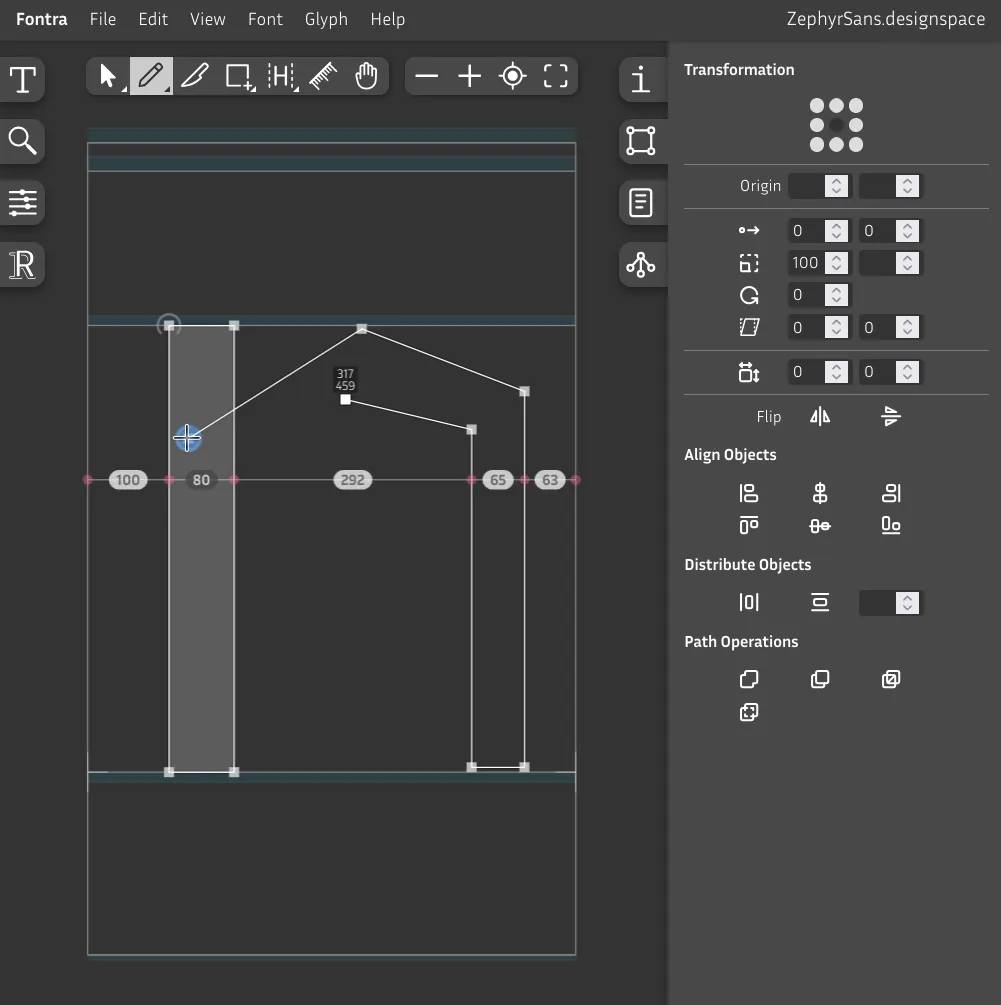
Let's pick the pencil tool to start drawing our own shape. We'll do the shoulder now.
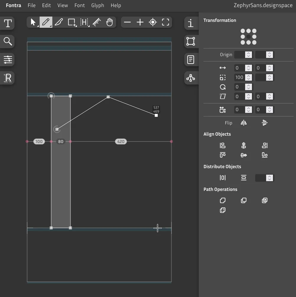
Hold Shift to lock the X or Y axis down, then draw a straight line downwards.
We then close this shape by drawing our way back to the initial point where we click to finish. You'll see a blue circle while hovering the node, clicking here will close the contour.
You can also click on the middle of a line to split it with a node – you'll see the blue circle again.
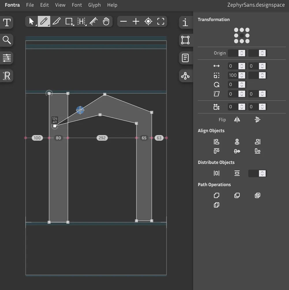
Now, to make the lines curved instead of straight, hold Alt and click with your Pencil tool. You'll see two smaller blue circles before clicking.
It's better to have the same angle on either side, so hold Shift when moving the handles.
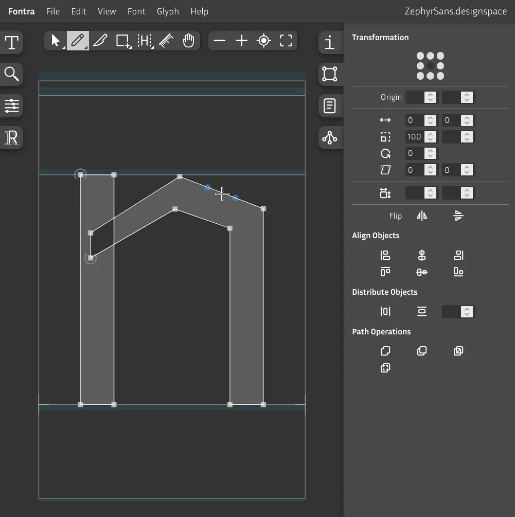
Once you're finished making all the lines curved, chances are it'll look a bit rough. That's fine for now.
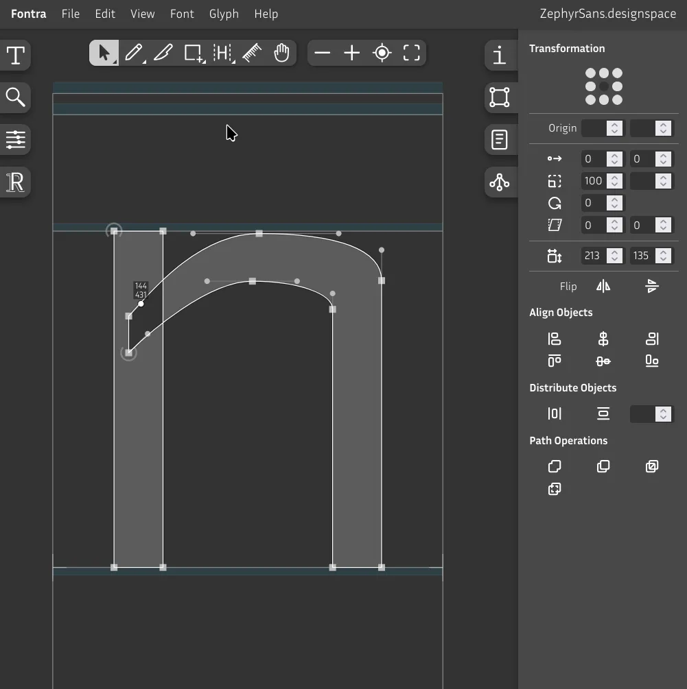
Make sure the shoulder goes up to the overshoot region.
Remember that it's rounded so it needs that compensation.
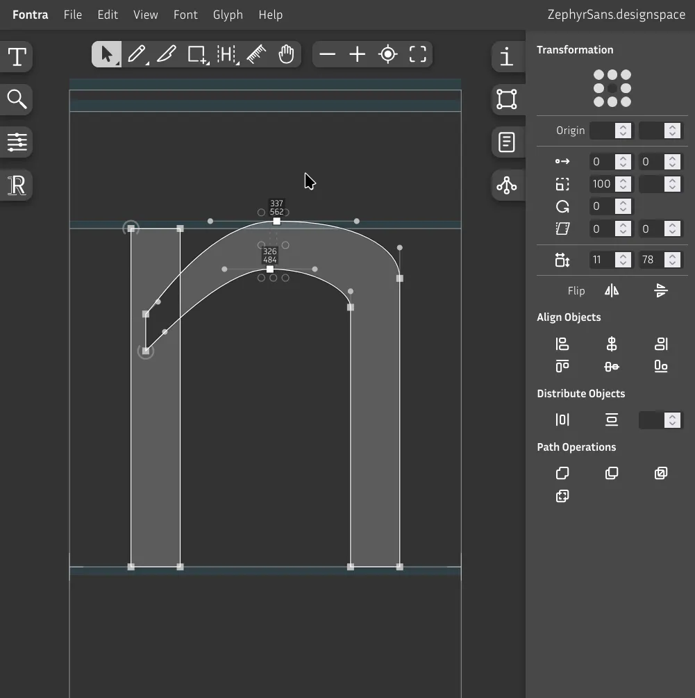
Now while having both nodes selected like in the picture, hold Alt and use the arrow keys to nudge the nodes left or right while keeping the curve handles where they are. Trust your eyes. Also nudge the nodes on the right side.
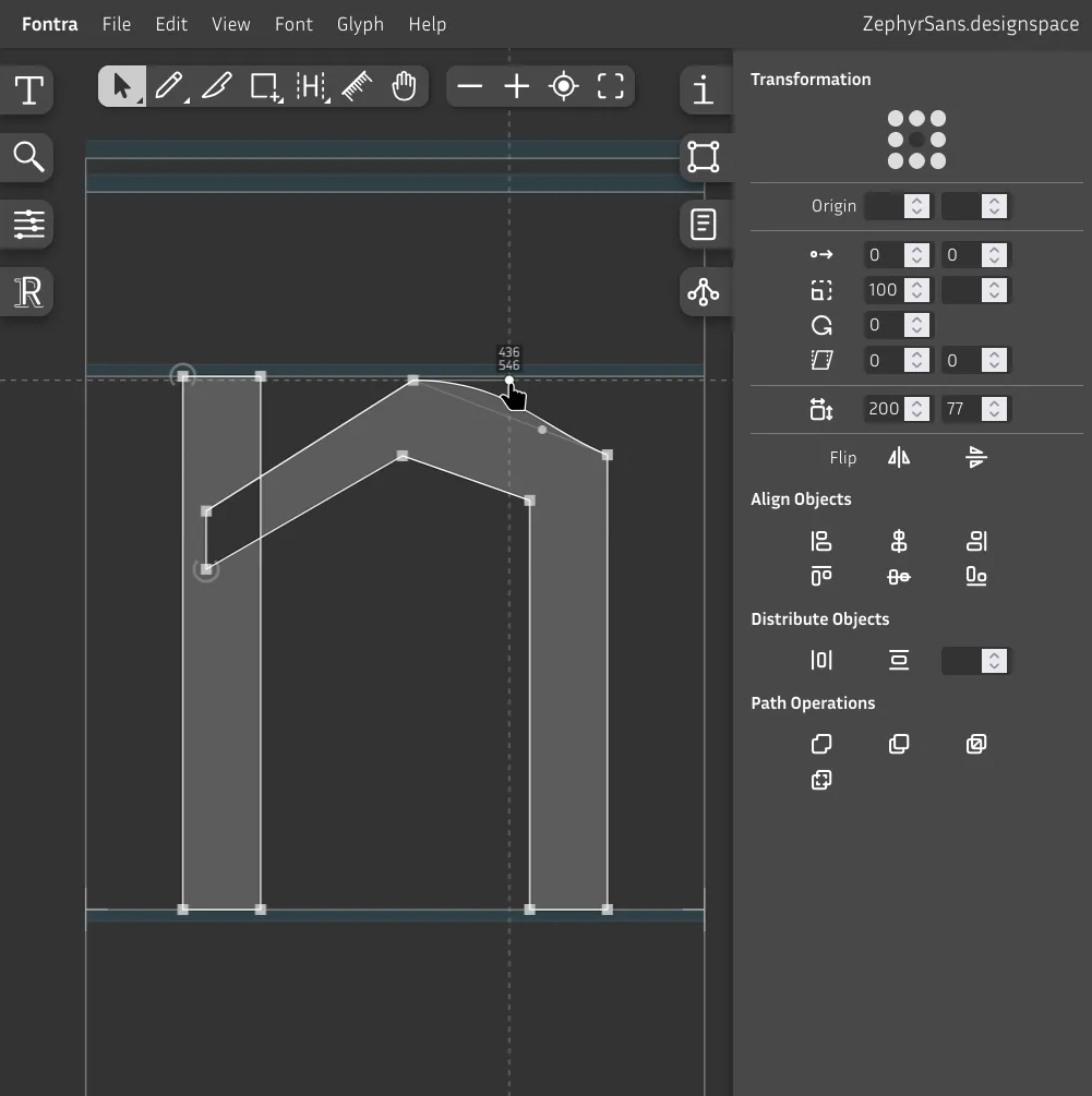
Now we have to think about stroke contrast, which would be how much narrower horizontal strokes are compared to vertical ones.
If you were to set both to, say, 80, the top side of N's shoulder would paradoxically look bolder/wider than the vertical lines on either side. This is yet another optical illusion that we need to compensate for.
If you want to make it visually the same, you should do about 10% less on horizontal strokes, which is what we'll do here by setting it to 72. You can make it more contrasty if you want.
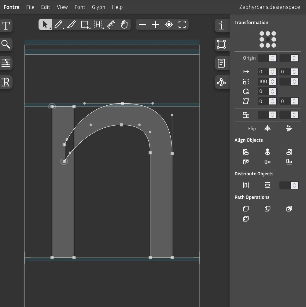
Now we have to fix that weird hole where both shapes intersect. Why is that happening? Well, it's because of the draw direction. Notice how every shape has a node with a half circle – that's where the shape starts to be drawn. If both shapes happen to have the same direction, they will combine. If they don't, they'll cancel each other out and leave a hole.
Best practice is to have additive shapes be drawn clockwise and subtractive ones like counters (the negative space in o for example) counter-clockwise.
I tend to set the start point of all shapes to the nodes closest to the top for simplicity. You might find that helpful.
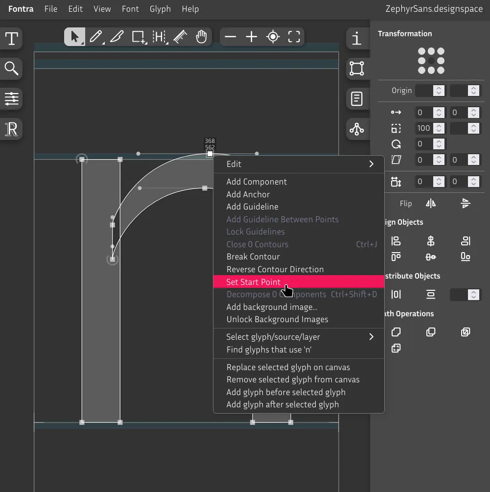
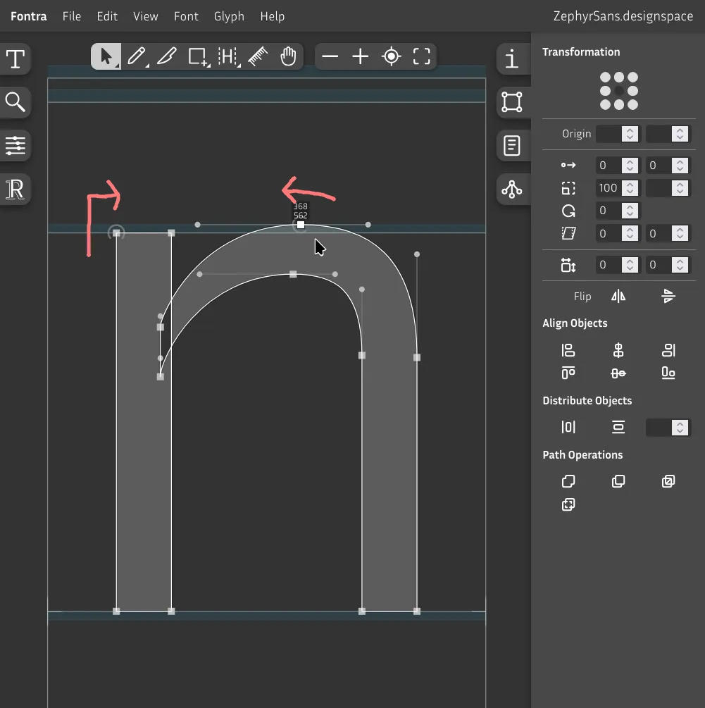
We can now see more clearly the direction it's being drawn in. Change it to clockwise to make it additive. Right click Reverse contour direction.
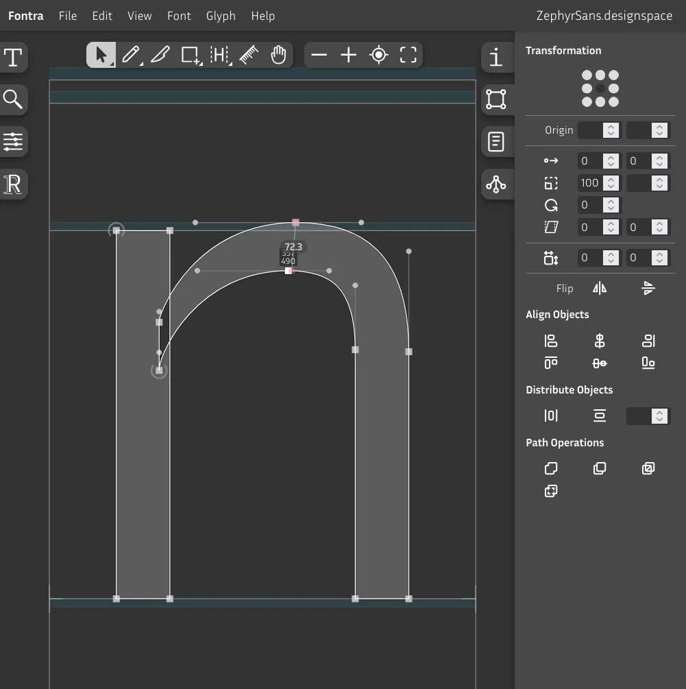
You can hold Space to hide the editor UI, preview the glyph with a solid color, and pan around the canvas.
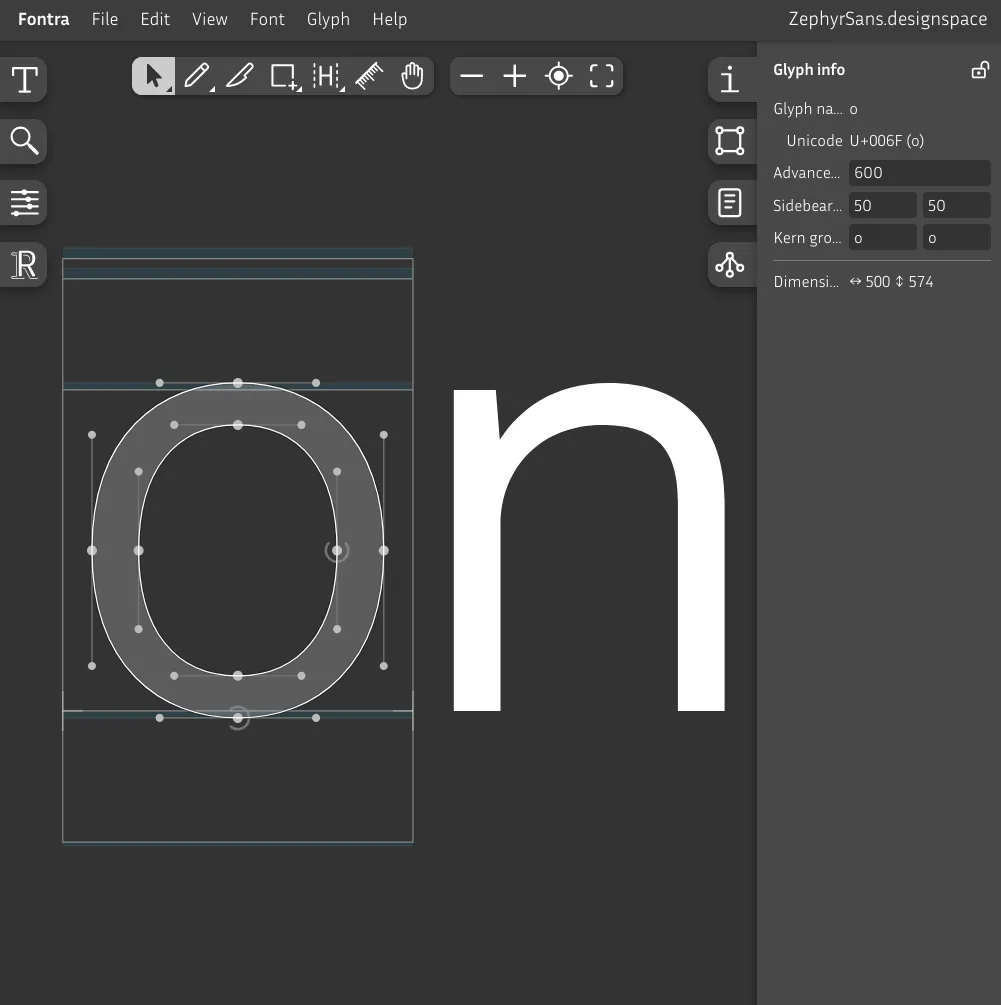
Now try drawing o by yourself. Remember that you should do both vertical and horizontal overshoots, so it should be wider than n – in this case, it's about 40 units wider horizontally, according to the Dimensions section in the Glyph info panel on the right.
I did some mining off-camera because the n glyph looked rough lol.
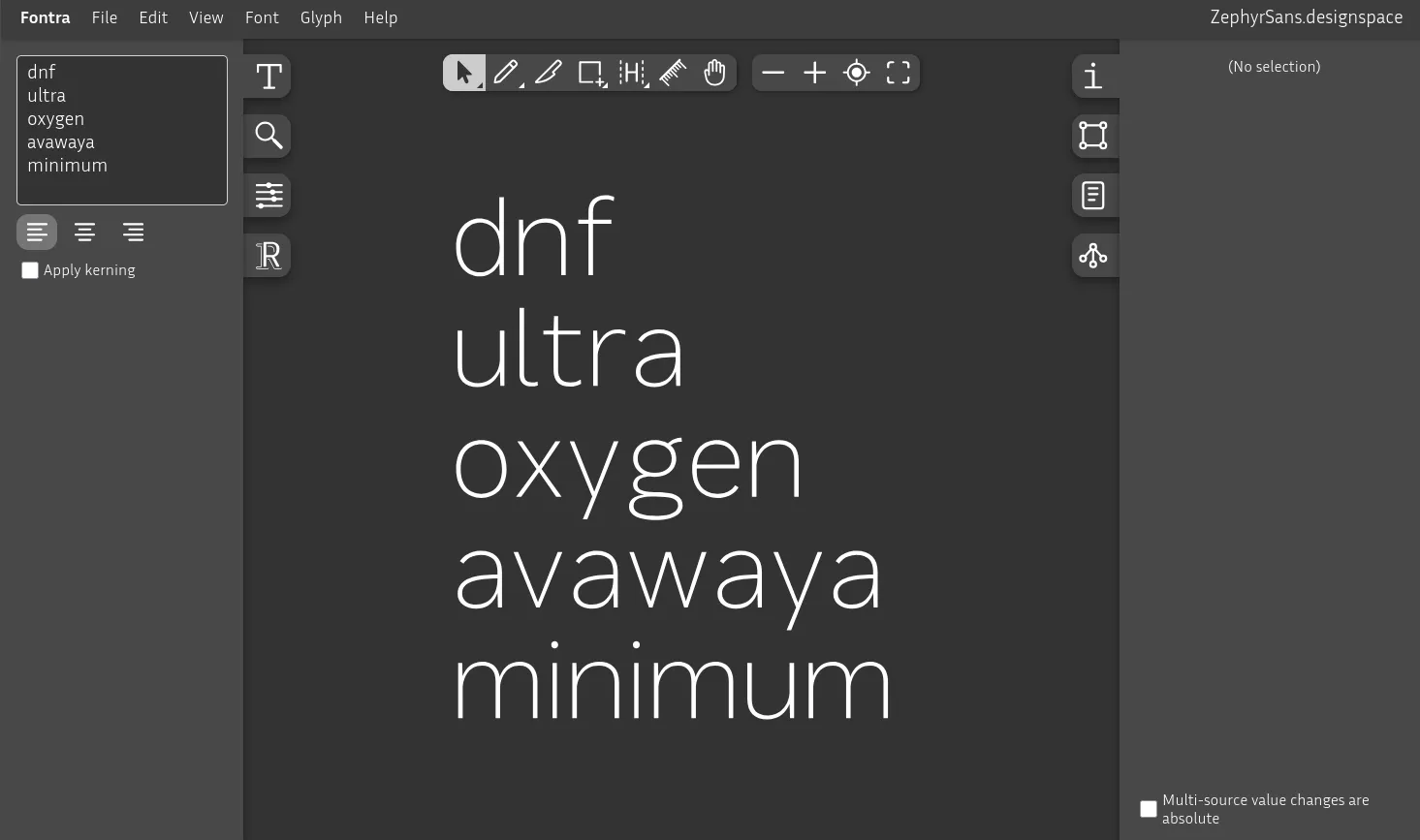
Espaciado
Te habrás dado cuenta que cuando dibujamos glifos reservamos un poco de espacio a cada lado para que no choquen entre sí. A este hueco se le llama espaciado.
A common analogy for this is volume, the liquid kind. Both the space between glyphs and the glyph's own counterform should have about the same visual volume.
The gap on the right side of i has more space for volume than, say, q, so we have to take that into consideration.
You could eyeball it but it's better to follow some sort of guideline to keep things consistent. One of those is the Tracy method, which we'll be using.
Diagonales
v
4w
4x
4y
4Astas verticales bajas
r
4m
2j
1u
2i
1Astas verticales altas
b
5p
5k
4l
2h
2Redondeadas
c
6e
6q
1d
1Irregulares
g
*a
*s
*z
*f
*t
*| Descripción | Unidades | |
|---|---|---|
| 1 | Igual al espaciado izquierdo de n | 75 |
| 2 | Igual al espaciado derecho de n | 70 |
| 3 | Un pelín más que el espaciado izquierdo de n | 80 |
| 4 | Espaciado mínimo | 40 |
| 5 | Mismo espaciado que o | 55 |
| 6 | Un pelín menos de espaciado que o | 50 |
| * | Ajustado a mano | — |
Kerning
Ojo, solo tendrías que empezar a hacer kerning una vez que hayas terminado completamente con el espaciado normal.
Hay algunos pares como r., r-, fo y lt que por mucho que ajustes el espaciado siguen teniendo espacio de más o de menos, y que no hay más remedio que ajustarlo a mano.
Los que tengan astas diagonales, tails o astas transversales tienen espacios un poco extraños. Anything with diagonals, tails or crossbars is akwardly spaced.
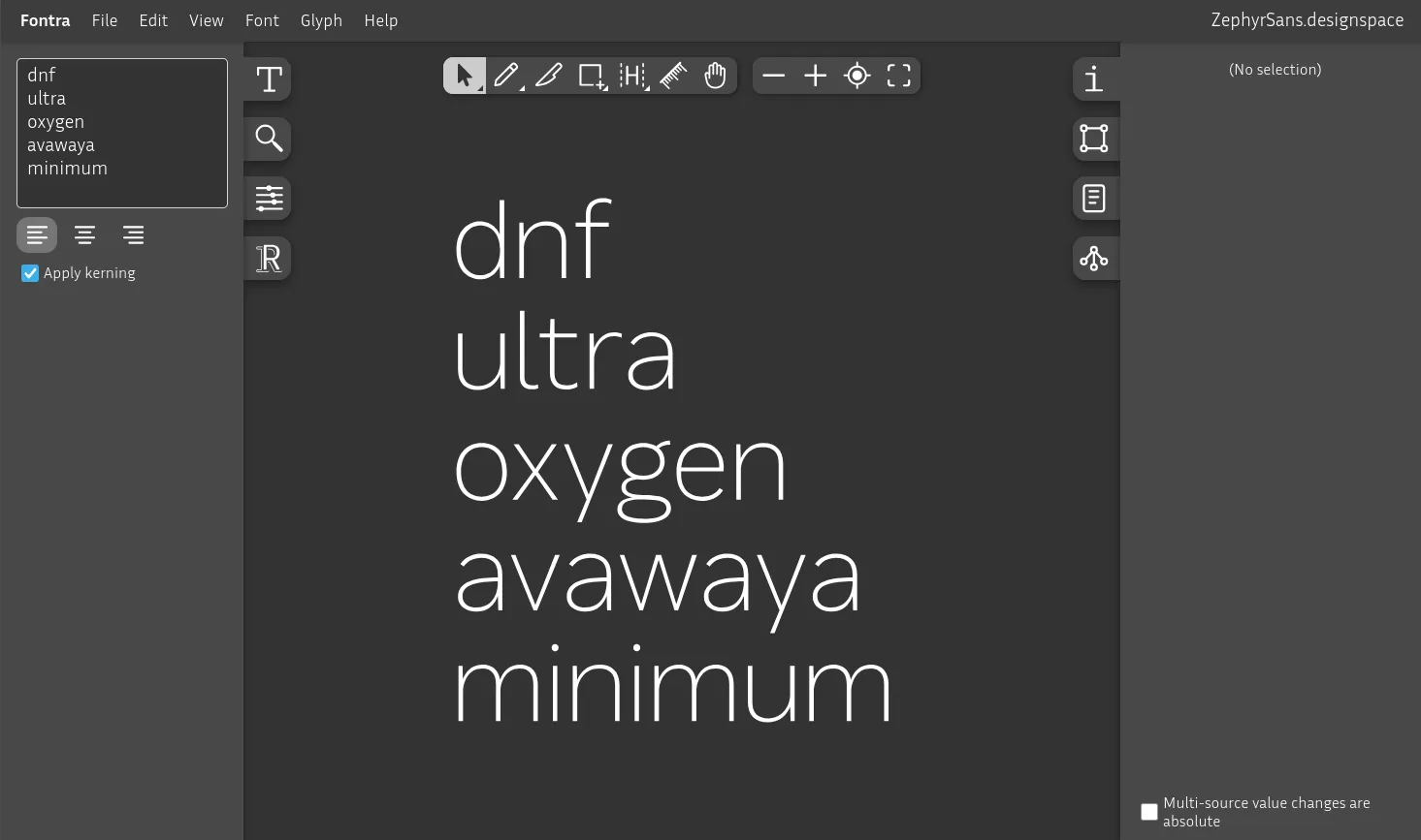
Sure, we could go letter by letter and try every permutation and manually adjust it but that's too time-consuming. We'll define groups of similar shapes on either side called classes.
Clases de kerning
This isn't really covered in Designing Type all that much – probably because there's no perfect way to approach this. I found this one somewhere on the internet, and I can't seem to find where it was anymore. My only tweak was adding d and q to the right side verticals, which is based on the RoboFont docs.
Lado izquierdo
Verticales
Redondeados
Diagonales
Lado derecho
Verticales
Redondeados
Diagonales
Con arcos
Diagonales (desc)
Now, these classes can be called anything, like straight-up just verticals or diagonals-desc, but when you tweak a bunch of them it's a bit too annoying so I just use the parent letter directly.
The left and right classes are independent so we can set both sides to the same letter and it'll apply the right one.
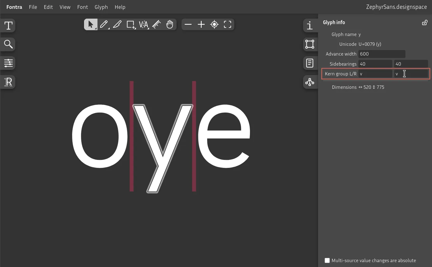
The letter y is part of the diagonals group in both left and right, where the parent is v.
Go letter by letter setting the parent per side.
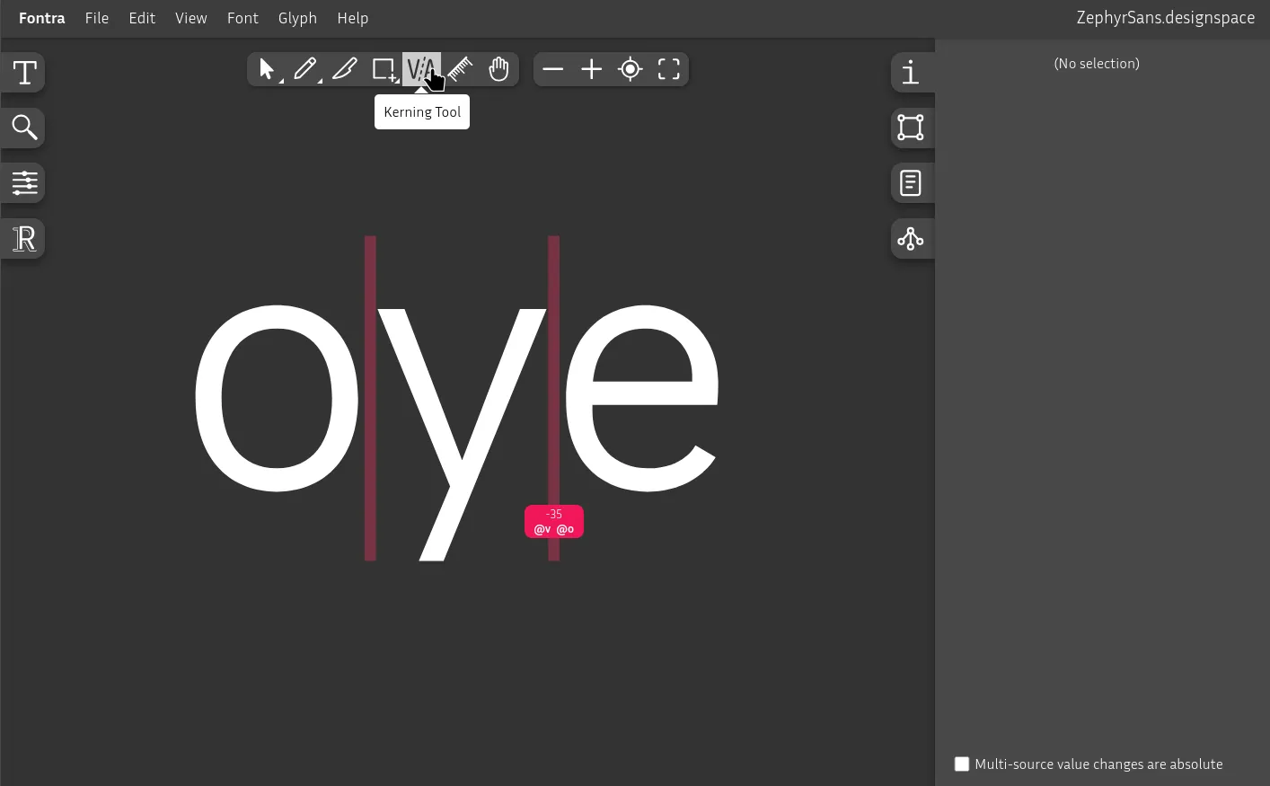
You can click and drag between letters to add or remove units from the pair.
@v and @o are the class names that we've set to every letter in its group.
You can search for common kerning pairs. Don't overdo it, it's fine to not cover uncommon edge cases. There are too many permutations for you to be able to handle every single combination.
Curvas de interpolación
Imagina que tenemos una familia tipográfica compuesta por varios pesos. Si en el peso Regular/400 tenemos el [todo] stem width a 80 unidades, y definimos el rango de 100 a 900 con ±60 unidades escalados de forma [todo] linear, nos costará discernir los tonos más oscuros de los claros en cuanto al gris tipográfico se refiere. Necesitaremos exponencialmente más contraste en cuanto más oscuro se vuelva este.
Since strokes/form and counterform blur together into a typographic gray, we have to apply this here too.
No quiero meterme demasiado en este tema, así que dejaré las partes clave aquí para que lo investigues por tu cuenta:
- Teoría de interpolación de Luc(as) de Groot
- Impallari
- Schneider: (Lucas + Impallari) / 2
- CSS Ogee de Abraham Lee
- Mapeo de ejes en la documentación de Google Fonts
type StrokeCurveConfig = {
  minWeight:  number
  maxWeight:  number
  minStroke:  number
  maxStroke:  number
  curvature?: number
}

const strokeFromWeight = (
  weight: number,
  {
    minWeight,
    maxWeight,
    minStroke,
    maxStroke,
    curvature = 1 // luc(as) de groot fallback
  }: StrokeCurveConfig
) => {
  const ratio = maxStroke / minStroke
  const t =
    Math.min(1, Math.max(0, // clamp to 0..1
      (weight - minWeight)
      / (maxWeight - minWeight)))

  return minStroke * ratio ** (t ** curvature)
}

//
//

const Zephyr: StrokeCurveConfig = {
  minWeight: 50,
  maxWeight: 900,
  minStroke: 27,
  maxStroke: 207,
  curvature: 1 / Math.sqrt(2)
}

strokeFromWeight(50,  Zephyr) // 27
strokeFromWeight(100, Zephyr) // rounded to 36
strokeFromWeight(200, Zephyr) // rounded to 49
strokeFromWeight(300, Zephyr) // rounded to 64
strokeFromWeight(400, Zephyr) // rounded to 80
strokeFromWeight(500, Zephyr) // rounded to 99
strokeFromWeight(600, Zephyr) // rounded to 121
strokeFromWeight(700, Zephyr) // rounded to 146
strokeFromWeight(800, Zephyr) // rounded to 174
strokeFromWeight(900, Zephyr) // 207Lectura complementaria
- Designing Type de Karen Cheng
- The Stroke: Theory of Writing de Gerrit Noordzij