Making your own fonts with Fontra
I've been working on a custom typeface called Zephyr Sans on and off for about a year. It attempts to be a fresh take on the vibes from KDE's Breeze icons and the old Oxygen Sans family.

It took a decent amount of research to get this far, and I still consider myself a bit of a noob. But I can try to smooth the bumps for you if you want to do a similar project.
As you can probably guess, we'll be using Fontra, an open-source editor that works in all the usual places.
Creating a typeface
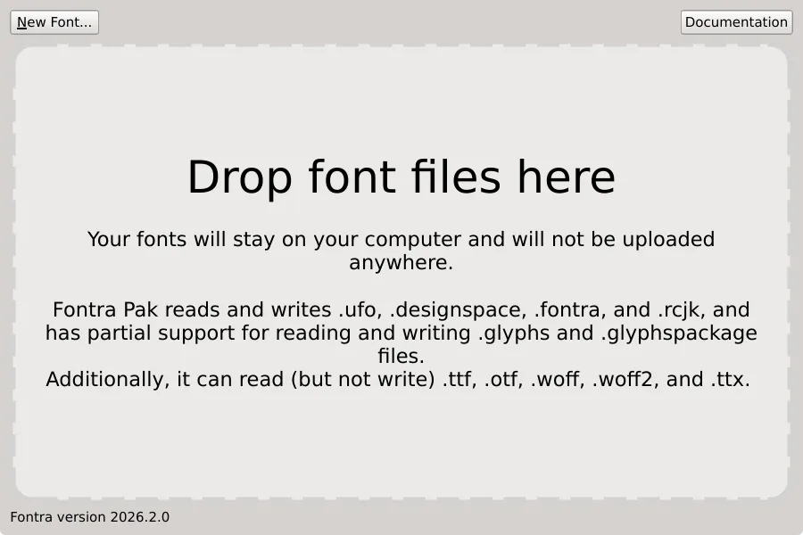
First off, we install FontraPak from fontra.xyz, which runs both the server and client locally on your computer.
The client/server split allows you to have Figma-style real-time collaboration, but we don't really care about that at the moment.
Once opened, a window like the following will appear:
Click on New Font on the top left. You'll see multiple formats (Designspace, Fontra, RoboCJK and UFO). Pick Designspace.
UFO is the standard app-independent format for a single font (folders like MyFont_Light.ufo, MyFont_Regular.ufo and so on).
Designspace is a folder of UFOs (plus a .designspace XML file) that combines those fonts into the single typeface. By picking Designspace you're both future proofing your font in case you ever want to scale it up, while still allowing for other potential contributors to use their preferred editor like Glyphs, RoboFont, FontLab etc. which may have advanced features like plugins, curvature combs and non-Latin language support.
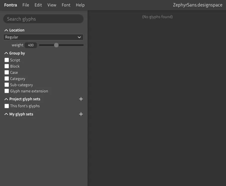
You should see a page like the following open up in your browser:
Adding glyph sets
Glyph sets are a way to specify which characters you plan on supporting on your typeface. You can pick a standardized glyph set from an existing collection like the one from Google Fonts.
See the sidebar on the left? Click on the button to the right of Project glyph sets. Select the Google Fonts collection and check GF Latin Kernel for now, then save.
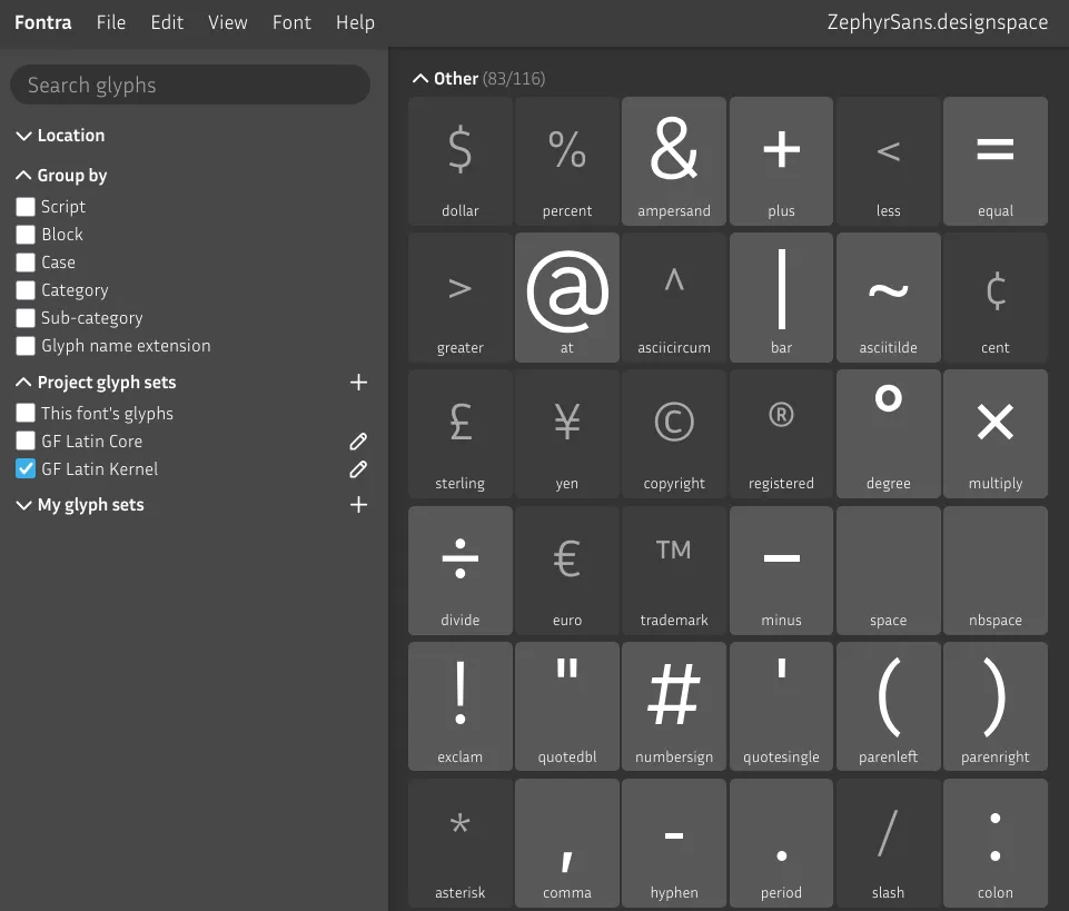
You'll now see the coverage on your font, with light gray cards containing a preview for existing glyphs.
Line metrics
Before we start drawing any glyphs, we need to think about the anatomy of the font we want to make.

A default Fontra Designspace project has 1000 units per em but you may come across 1024, 2000 or 2048 sometimes. Variable fonts generally speaking need a higher UPM.
While the format itself is vector based, the nodes snap unit by unit based on this resolution as if it were pixel based.
Now out of these 1000 vertical units we have to pick how many go to each section. Get some paper out and sketch a bit. Draw enough glyphs to figure out the proportions for the ascender, x-height and descender. Then try to retroactively give it sizes by literally measuring on paper and rounding.
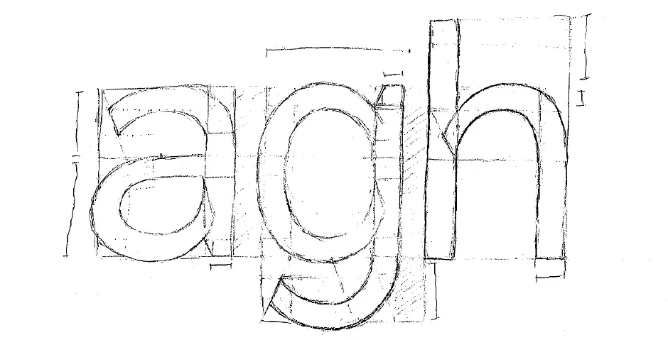
You can probably tell I drew this sketch before I learned all of this.
In this case I chose to make the a double-storey and based my measurements around where the bowl and the hook meet.
Cap height should be derived from the x-height. Body fonts (those used for long-form text at small sizes) should sit between 65% and 75% cap height to x-height ratio.
I picked as close to 75% as possible – around where Inter and Helvetica sit – as my intention for this font is to be used on user interfaces. 550/740 is ≈ 75%, 775-550 = 225 (which matches the descender).
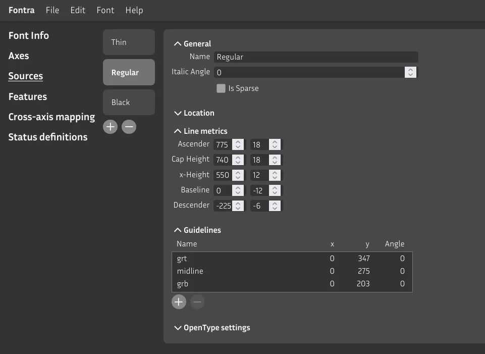
The values on the left should sum up to your units per em (default to 1000), 775 + 225 = 1000.
Compensating for optical illusions
The number inputs on the right of each metric act as buffer zones for overshoots. As a rule of thumb, the smaller in size you expect the font to be used, the greater the buffer has to be.
Read this page to catch up to speed on this.
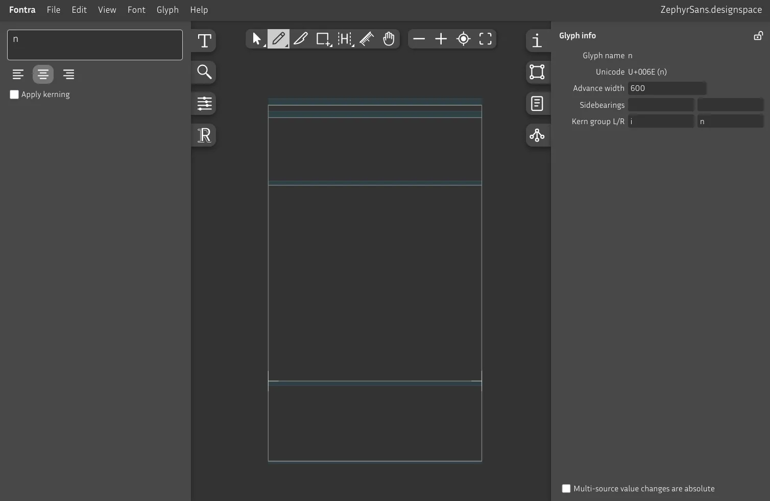
Drawing our first glyph in Fontra
We can now start drawing our first glyphs, n and o. These will act as the base for the others.
Go back to the glyph grid and double click the n card. A new editor tab will open. The UI is pretty self-explanatory so just play around with it and we'll start drawing once you come back.
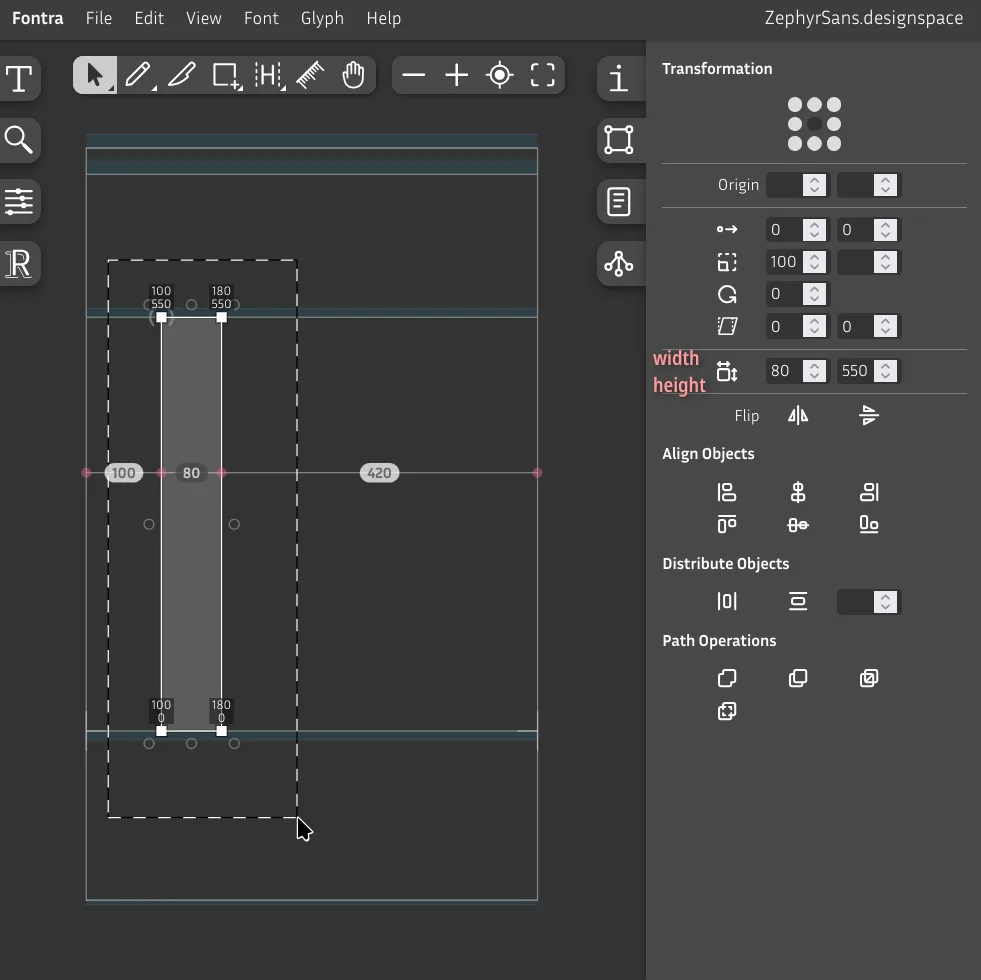
Select the rectangle tool, and add a rectangle from x-height to baseline to make a vertical stroke. Unlike on editors like Figma, the selection tool (Pointer) doesn't select the entire shape by just clicking on the fill. For that, double click on the shape's path.
On the right sidebar, select the Selection Transformation tab, then select a shape to see its width and height.
There's also an option to see the coordinates on each selected node. It's on View Glyph editor appearance Coordinates.
There's also a Ruler tool that sticks and rotates along the closest edge where you click, which is pretty handy.
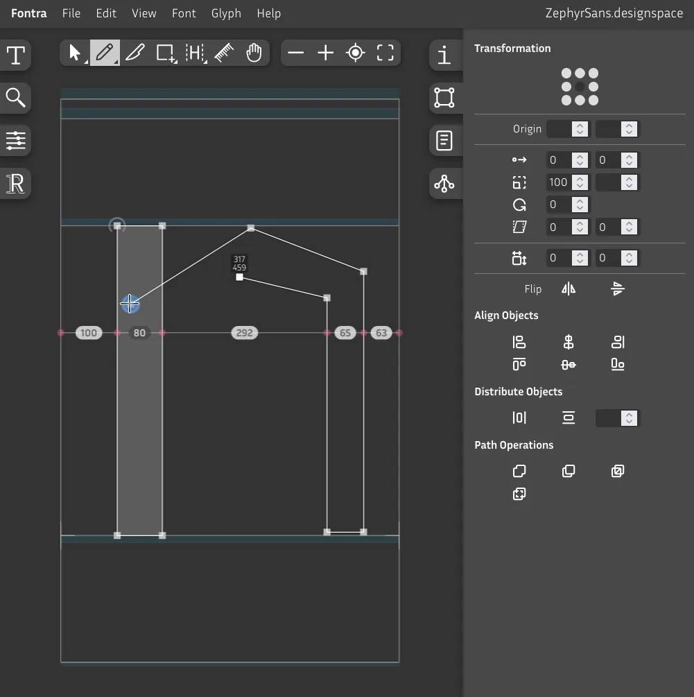
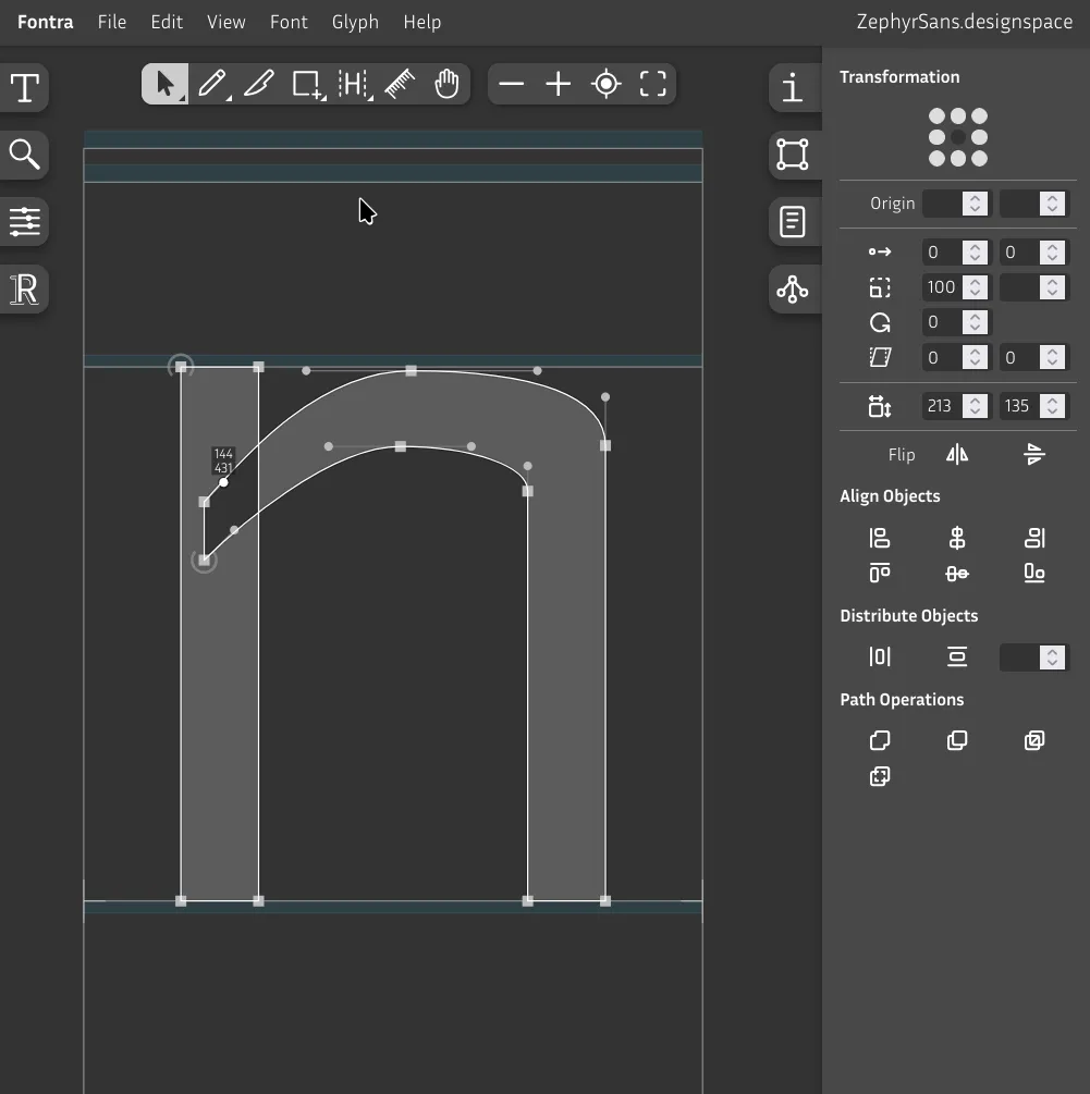
Let's pick the pencil tool to start drawing our own shape. We'll do the shoulder now.
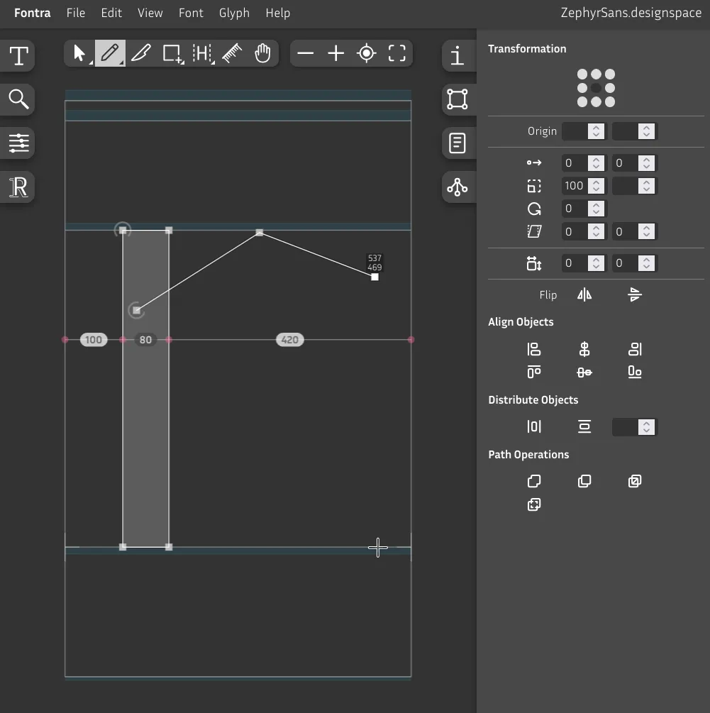
Hold Shift to lock the X or Y axis down, then draw a straight line downwards.
We then close this shape by drawing our way back to the initial point where we click to finish. You'll see a blue circle while hovering the node, clicking here will close the contour.
You can also click on the middle of a line to split it with a node – you'll see the blue circle again.
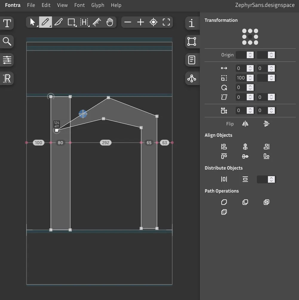
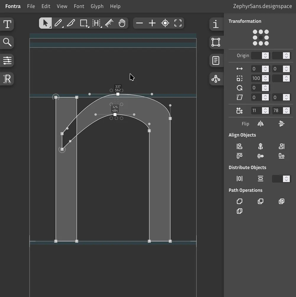
Now, to make the lines curved instead of straight, hold Alt and click with your Pencil tool. You'll see two smaller blue circles before clicking.
It's better to have the same angle on either side, so hold Shift when moving the handles.
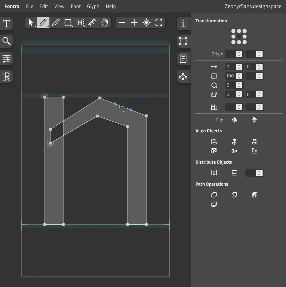
Once you're finished making all the lines curved, chances are it'll look a bit rough. That's fine for now.
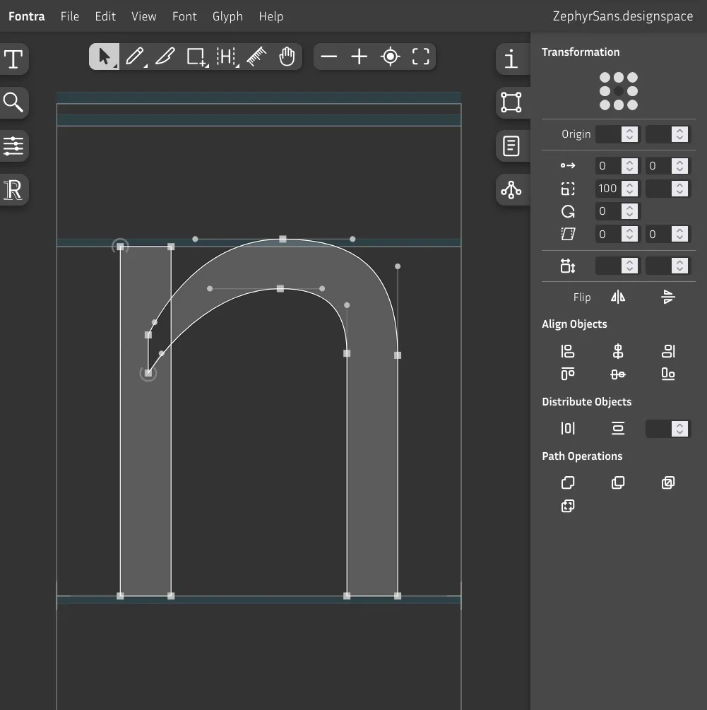
Make sure the shoulder goes up to the overshoot region.
Remember that it's rounded so it needs that compensation.
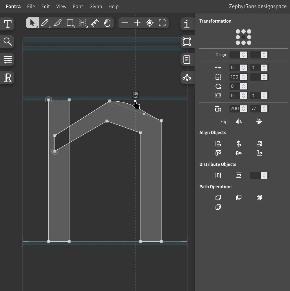
Now while having both nodes selected like in the picture, hold Alt and use the arrow keys to nudge the nodes left or right while keeping the curve handles where they are. Trust your eyes. Also nudge the nodes on the right side.
Now we have to think about stroke contrast, which would be how much narrower horizontal strokes are compared to vertical ones.
If you were to set both to, say, 80, the top side of N's shoulder would paradoxically look bolder/wider than the vertical lines on either side. This is yet another optical illusion that we need to compensate for.
If you want to make it visually the same, you should do about 10% less on horizontal strokes, which is what we'll do here by setting it to 72. You can make it more contrasty if you want.
Now we have to fix that weird hole where both shapes intersect. Why is that happening? Well, it's because of the draw direction. Notice how every shape has a node with a half circle – that's where the shape starts to be drawn. If both shapes happen to have the same direction, they will combine. If they don't, they'll cancel each other out and leave a hole.
Best practice is to have additive shapes be drawn clockwise and subtractive ones like counters (the negative space in o for example) counter-clockwise.
The de-facto standard most seem to have converged to is setting the start point of every shape to the closest point to the bottom left. I've since moved to using that in my typefaces also.
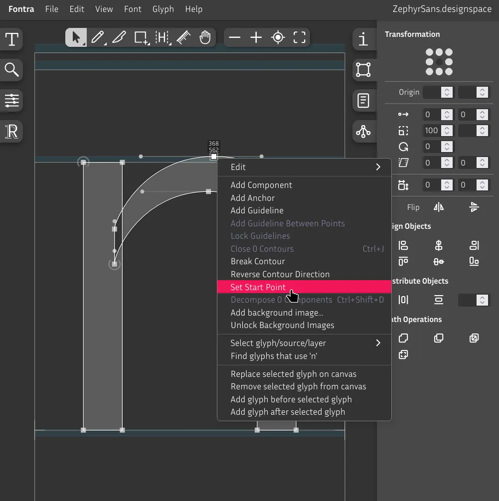
You can still set it to the top or wherever you prefer.
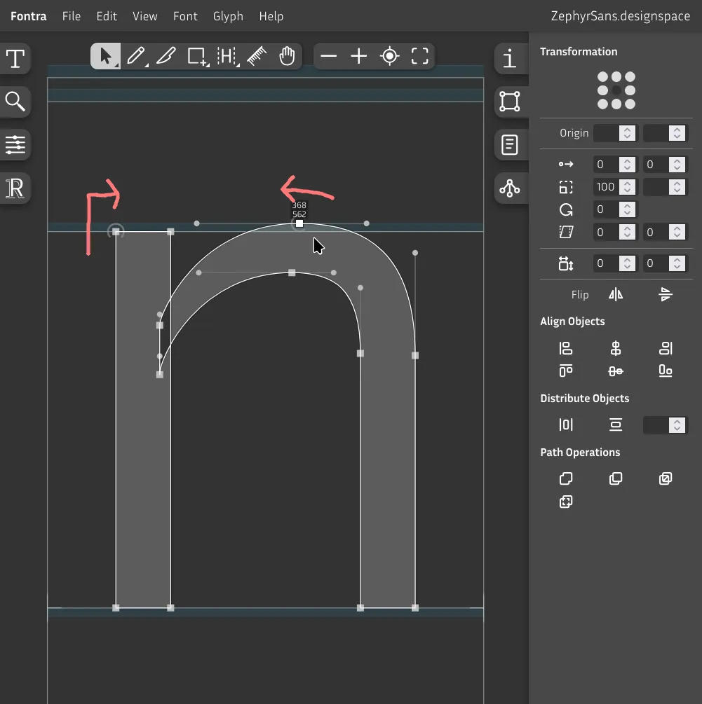
We can now see more clearly the direction it's being drawn in. Change it to clockwise to make it additive. Right click Reverse contour direction.
You can hold Space to hide the editor UI, preview the glyph with a solid color, and pan around the canvas.

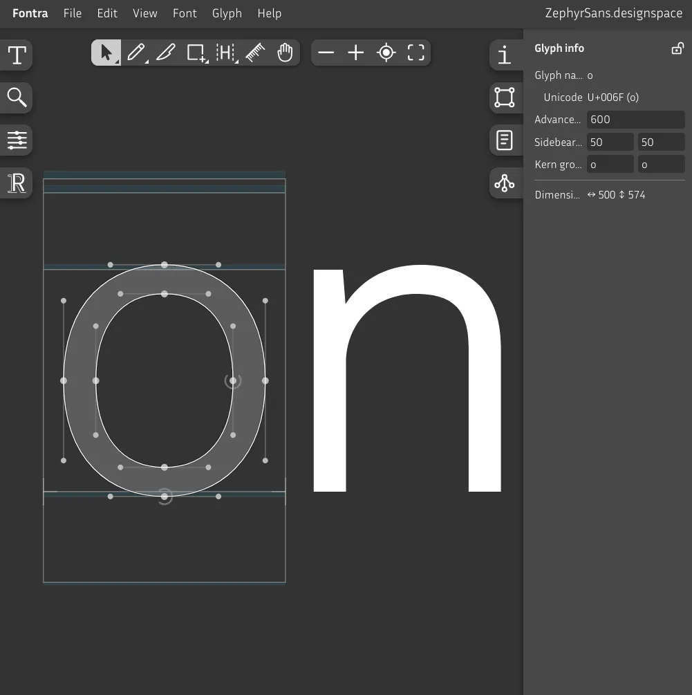
Now try drawing o by yourself. Remember that you should do both vertical and horizontal overshoots, so it should be wider than n – in this case, it's about 40 units wider horizontally, according to the Dimensions section in the Glyph info panel on the right.
I did some mining off-camera because the n glyph looked rough lol.
Side bearings
Notice how when we draw glyphs we reserve some space on either side of them so they don't scrape against each other. That space is what's called the side bearings.
A common analogy for this is volume, the liquid kind. Both the space between glyphs and the glyph's own counterform should have about the same visual volume.
The gap on the right side of r has more space for volume than, say, q, so we have to take that into consideration.
You could eyeball it but it's better to follow some sort of guideline to keep things consistent. One of those is the Tracy method, which we'll be using.
Diagonals
v
4w
4x
4y
4Short vertical stems
r
4m
2j
1u
2i
1Tall vertical stems
b
5p
5k
4l
2h
2Rounded
c
6e
6q
1d
1Irregulars
g
*a
*s
*z
*f
*t
*| Description | Units | |
|---|---|---|
| 1 | Same as left side bearing of n | 75 |
| 2 | Same as right side bearing of n | 70 |
| 3 | Slightly more than left side bearing of n | 80 |
| 4 | Minimum side bearings | 40 |
| 5 | Same side bearings as o | 55 |
| 6 | Slightly less than side bearings of o | 50 |
| * | Adjusted visually by hand | — |
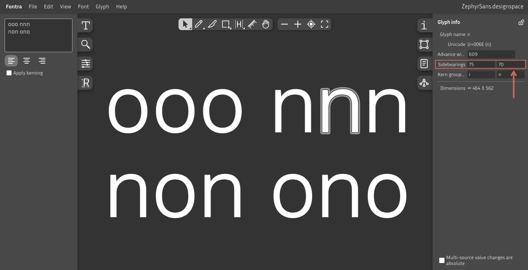
As I alluded to before, o and n are pretty important to nail down before we do the rest of the glyphs. Now we know why: we'll set by eye the units that feel nice and balanced and use those as a base.
Open the Selection Info tab on the right sidebar and tweak the side bearings of n and o until you're happy with the results.
You can now draw the rest of the glyphs, then apply the sidebearings based on your own table. You can use either the text inputs highlighted on the previous image, or the tool button with H on it.
Here's a cool trick: say you're setting the right side bearing of b, which would be the same value as the one in o. You can just set the value to o and Fontra will automatically translate it.
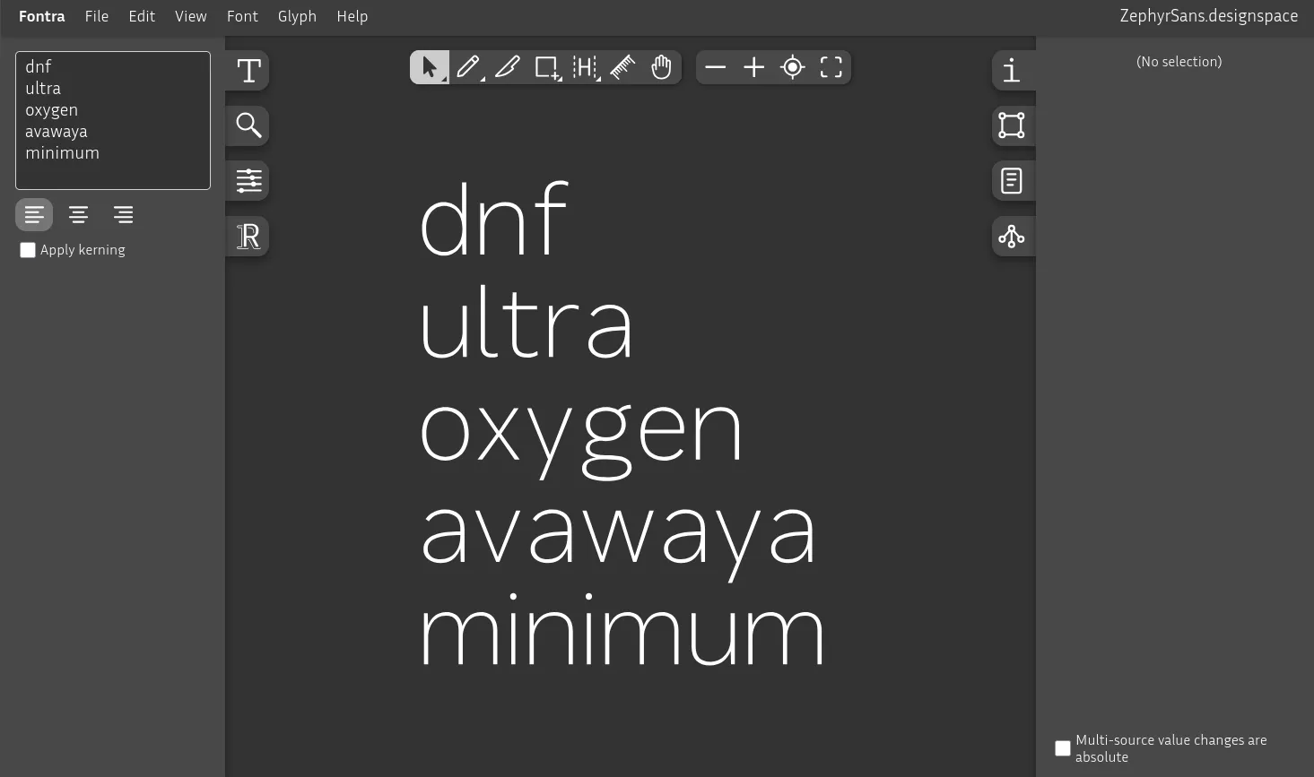
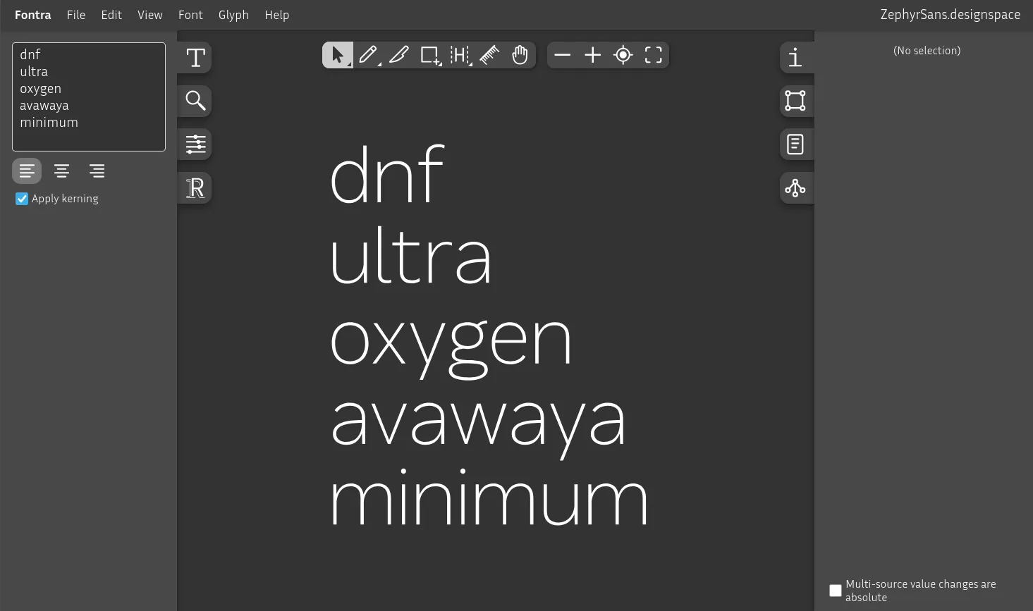
Kerning
Note: You should only start once you've completely finished setting all side bearings.
There are some pairs like r., r-, fo and lt that, regardless of what you set their side bearings to, still need to be kerned by hand so that they don't end up with too little or too much space.
Anything with diagonals, tails or crossbars is awkwardly spaced.
Not perfect but acceptable
Sure, we could go letter by letter and try every permutation and manually adjust it but that's too time-consuming. We'll define groups of similar shapes on either side called classes.
Kerning classes
This isn't really covered in Designing Type all that much. Probably because there's no right way to approach this. I found this one somewhere on the internet, and I can't seem to find where it was anymore. Only tweak to the original was adding d and q to the right side verticals, which is based on the RoboFont docs.
Left side
Verticals
Rounded
Diagonals
Right side
Verticals
Rounded
Diagonals
Arches
Diagonals (desc)
Now, these classes can be called anything, like straight-up just verticals or diagonals-desc, but when you tweak a bunch of them it's a bit too annoying so I just use the parent letter directly.
The left and right classes are independent so we can set both sides to the same letter and it'll apply the right one.
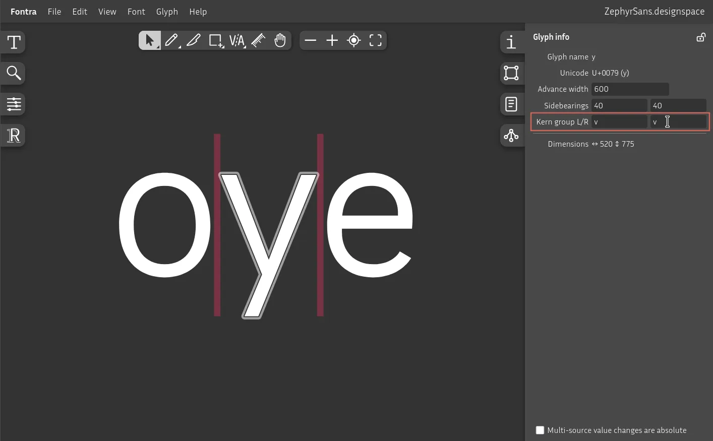
The letter y is part of the diagonals group in both left and right, where the parent is v.
Go letter by letter setting the parent per side.
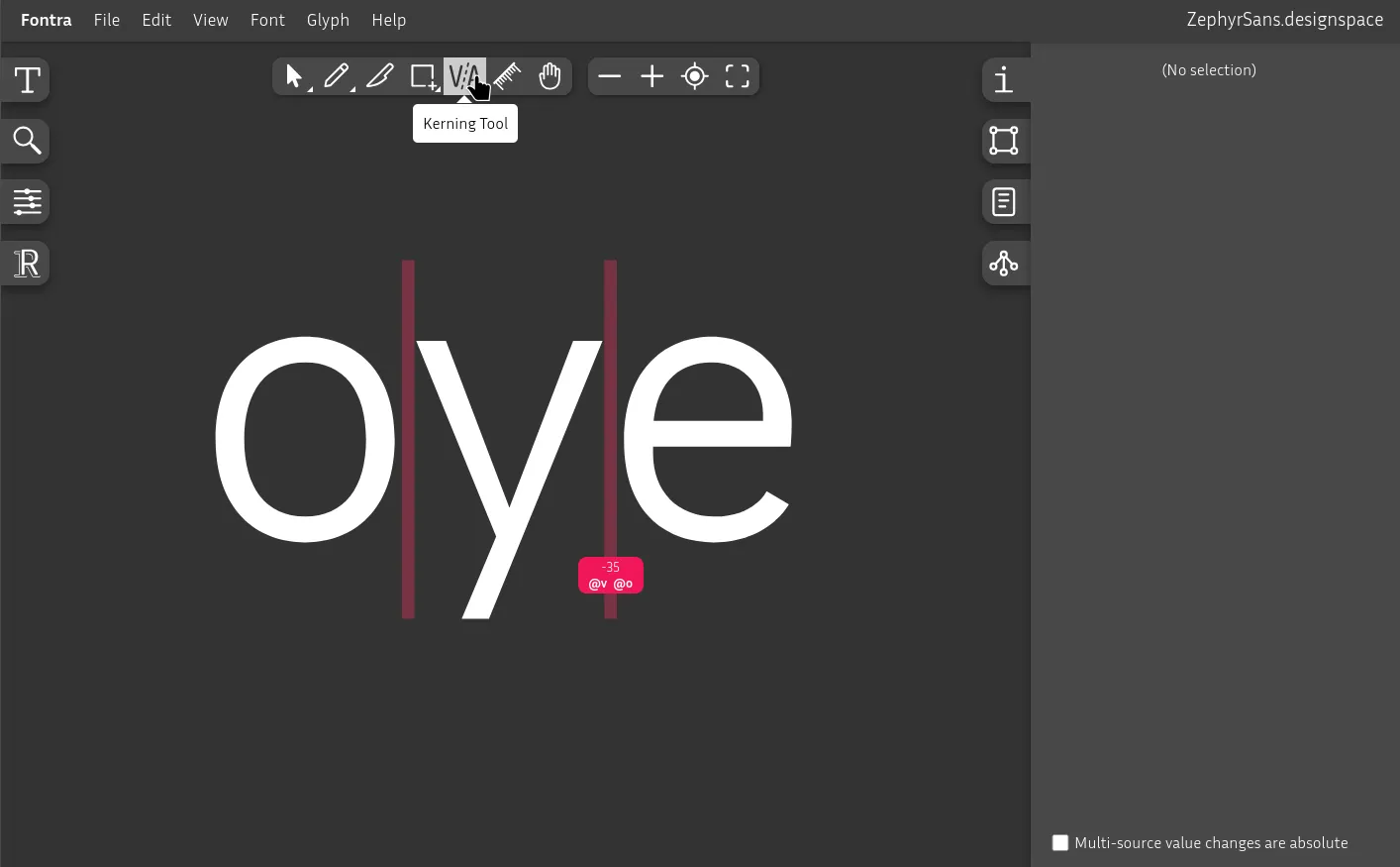
You can click and drag between letters to add or remove units from the pair.
@v and @o are the class names that we've set to every letter in its group.
You can search for common kerning pairs. Don't overdo it, it's fine to not cover uncommon edge cases. There are too many permutations for you to be able to handle every single combination.
This is the one step that I think has the most potential to be improved further down the line. I'll be exploring ways of automating this process in later posts.
Interpolation curves
Imagine we have a type family composed of multiple weights. If we set the stem width in Regular/400 to 80 units and adjust it up and down linearly by the same step size, it wouldn't really look linear to us – we have a harder time discerning dark tones from light ones, and need exponentially more contrast the darker we go.
Since strokes/form and counterform blur together into a typographic color, we have to apply this here too.
I don't want to get super into the weeds in this one so I'll leave some of the key details here for you to research:
- Luc(as) de Groot interpolation theory
- Impallari
- Schneider: (Lucas + Impallari) / 2
- CSS Ogee by Abraham Lee
- Axis mapping in Google Fonts docs
type StrokeCurveConfig = {
  minWeight:  number
  maxWeight:  number
  minStroke:  number
  maxStroke:  number
  curvature?: number
}

const strokeFromWeight = (
  weight: number,
  {
    minWeight,
    maxWeight,
    minStroke,
    maxStroke,
    curvature = 1 // luc(as) de groot fallback
  }: StrokeCurveConfig
) => {
  const ratio = maxStroke / minStroke
  const t =
    Math.min(1, Math.max(0, // clamp to 0..1
      (weight - minWeight)
      / (maxWeight - minWeight)))

  return minStroke * ratio ** (t ** curvature)
}

//
//

const Zephyr: StrokeCurveConfig = {
  minWeight: 50,
  maxWeight: 900,
  minStroke: 27,
  maxStroke: 207,
  curvature: 1 / Math.sqrt(2)
}

strokeFromWeight(50,  Zephyr) // 27
strokeFromWeight(100, Zephyr) // rounded to 36
strokeFromWeight(200, Zephyr) // rounded to 49
strokeFromWeight(300, Zephyr) // rounded to 64
strokeFromWeight(400, Zephyr) // rounded to 80
strokeFromWeight(500, Zephyr) // rounded to 99
strokeFromWeight(600, Zephyr) // rounded to 121
strokeFromWeight(700, Zephyr) // rounded to 146
strokeFromWeight(800, Zephyr) // rounded to 174
strokeFromWeight(900, Zephyr) // 207Further reading
- Designing Type by Karen Cheng
- The Stroke: Theory of Writing by Gerrit Noordzij